E-commerce Checkout Optimization: Reducing Cart Abandonment in 2026
Optimizing the e-commerce checkout experience is paramount for online businesses aiming to maximize conversion rates and revenue. In a competitive digital landscape, even minor friction points in the purchasing journey can lead to significant losses. This article delves into the intricacies of checkout flow optimization, offering actionable strategies to transform browsing visitors into loyal customers. We will explore the common pitfalls that lead to cart abandonment and present refined architectural and user experience approaches, alongside technical performance enhancements, to build a seamless and highly effective checkout process.
The journey through an e-commerce site culminates at the checkout, a critical juncture where design, functionality, and trust converge. A well-designed checkout is not merely a transaction portal; it is a strategic asset that can dramatically influence a business's bottom line. Understanding the psychological and practical barriers that deter customers at this final stage is the first step toward crafting an experience that encourages completion rather than abandonment.
Understanding Cart Abandonment
Cart abandonment represents one of the most significant challenges in online retail, illustrating the gap between purchase intent and actual conversion. Millions of dollars are lost annually due to customers initiating a purchase but failing to complete it. Addressing this issue requires a deep understanding of its root causes and financial implications.
Key Figures
The scale of cart abandonment is substantial. Recent studies indicate that the average cart abandonment rate across all industries hovers between 70% and 80%. For instance, Baymard Institute's research, compiling 49 different studies, places the average e-commerce cart abandonment rate at 69.82%. This means that for every 100 potential sales, nearly 70 are lost before the transaction is finalized. Mobile devices often show even higher abandonment rates, sometimes exceeding 85%, reflecting challenges with form entry, navigation, and page load times on smaller screens. The sheer volume of these lost opportunities underscores the imperative for businesses to scrutinize and refine their checkout processes.
Main Reasons
Customers abandon their carts for a multitude of reasons, ranging from unexpected costs to complex processes. Identifying these common deterrents is essential for targeted optimization.
- Unexpected Extra Costs: This is consistently the top reason for abandonment. Research shows that over 50% of users abandon a purchase if presented with unexpected shipping costs, taxes, or fees at checkout. Transparency about all costs upfront is highly effective in mitigating this.
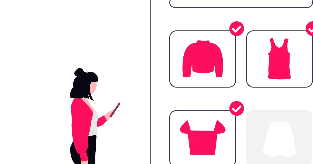
- Forced Account Creation: Many customers prefer a quick and easy guest checkout option. Requiring users to create an account can be a significant barrier, with studies suggesting around 30% of abandonments are due to this requirement.
- Long or Complicated Checkout Process: An excessively long checkout form with too many steps or irrelevant fields frustrates users. Every additional field increases the cognitive load and potential for errors.
- Website Errors or Crashes: Technical glitches, slow loading times, or broken payment gateways immediately erode trust and lead to abandonment. A seamless technical experience is non-negotiable.
- Lack of Trust in Payment Security: Concerns about the security of personal and payment information can cause users to hesitate. Visible trust badges, secure payment icons, and clear privacy policies are vital.
- Unsatisfactory Return Policy: Ambiguous or restrictive return policies can make customers reconsider their purchase, particularly for higher-value items.
- Limited Payment Options: Not offering a customer's preferred payment method can be a deal-breaker. A diverse range of popular payment gateways is often expected.
The Real Cost of Abandonment
The financial impact of cart abandonment extends beyond immediate lost sales. It encompasses the cost of acquiring those potential customers, the wasted marketing spend, and the long-term damage to customer lifetime value. Consider a scenario where an e-commerce store generates 1,000 leads, and 700 of them abandon their carts. Each of those leads had an acquisition cost, whether through advertising, content marketing, or other channels. This translates directly into squandered marketing investment.
Furthermore, a poor checkout experience can negatively affect brand perception, making it less likely for those customers to return in the future. In sectors like fashion and electronics, where average order values can be high, the cumulative losses from abandonment can run into millions of dollars annually for larger retailers. Addressing this issue is not merely about recovering lost sales; it is about protecting marketing investments, enhancing brand reputation, and securing future revenue streams. By proactively identifying and resolving the issues that cause customers to leave, businesses can unlock substantial untapped revenue and foster greater customer satisfaction.
Architecting a High-Performing Checkout
The foundational structure of your checkout flow significantly impacts its efficiency and conversion potential. A well-architected checkout balances simplicity, clarity, and the collection of necessary information without overwhelming the user.
One-Page vs. Multi-Step Checkout
The debate between one-page and multi-step checkouts often boils down to perceived complexity versus psychological comfort.
One-page checkouts present all fields on a single screen, aiming for fewer clicks and a quicker path to purchase. This approach can feel immediate and transparent, as users see everything required upfront. However, a lengthy one-page form can appear daunting, especially on mobile devices, potentially leading to immediate abandonment.
Multi-step checkouts, conversely, break the process into logical, manageable segments (e.g., shipping, billing, payment). While requiring more clicks, each step feels less demanding, offering a sense of progress and reducing cognitive load. This segmented approach can be particularly effective for complex purchases or when collecting extensive customer data. Modern implementations often use visual progress indicators to reinforce this sense of advancement.
The optimal choice depends on your product, customer base, and the amount of information required. For simpler transactions with minimal fields, a one-page checkout might suffice. For more involved processes, multi-step often provides a better user experience.
Guest Checkout and Friction
Forcing users to create an account before completing a purchase is a significant source of friction and a primary reason for abandonment. Guest checkout functionality allows customers to complete their order without registering an account, postponing or entirely removing this barrier to conversion. While encouraging account creation has benefits (e.g., easier reorders, personalized marketing), these should not come at the expense of initial sales.
Offering a prominent guest checkout option, alongside an optional "create an account" at the end of the transaction, is generally the most effective strategy. If account creation is strongly desired, ensure the process is minimal, perhaps auto-generating an account from the provided shipping/billing details and emailing login credentials.
Consider this simplified approach in your checkout component:
// components/checkout/CheckoutForm.tsx
import React, { useState } from 'react';
import { Button } from '@/components/ui/button';

export function CheckoutForm() {
  const [isGuest, setIsGuest] = useState(true);
  const [email, setEmail] = useState('');

  const handleSubmit = (e: React.FormEvent) => {
    e.preventDefault();
    console.log('Order submitted for:', email, isGuest ? '(Guest)' : '(Registered)');
  };

  return (
    <form onSubmit={handleSubmit} className="space-y-4">
      <div>
        <label htmlFor="email">Email Address</label>
        <input
          type="email"
          id="email"
          value={email}
          onChange={(e) => setEmail(e.target.value)}
          required
          className="w-full p-2 border rounded"
        />
      </div>
      {!isGuest ? (
        <p>Account creation fields here...</p>
      ) : (
        <Button onClick={() => setIsGuest(false)} variant="ghost">
          Create an account for faster checkout next time?
        </Button>
      )}
      <Button type="submit">Place Order</Button>
    </form>
  );
}
Progressive Disclosure
Progressive disclosure is a UX principle that advocates showing only essential information initially, revealing more details or options as the user needs them. In a checkout context, this means keeping forms concise and expanding sections only when actively engaged by the user. For instance, payment details might only appear after the user selects a payment method, or shipping options after an address is entered.
This technique reduces visual clutter and cognitive overload, making the checkout path feel less daunting. It allows users to focus on one task at a time, guiding them smoothly through the process.
Checkout UX Optimizations
Beyond the structural architecture, fine-grained user experience (UX) optimizations can significantly enhance checkout completion rates. These details often determine whether a user perseveres through the final steps or abandons their cart.
Smart Forms and Autocomplete
Intelligent form design is paramount. This includes:
- Autofill and Autocomplete: For addresses, cities, states, and even payment details (securely, via browser autofill or payment processor integrations), these features save considerable time and reduce typing errors. Integrating with address validation APIs can also prevent shipping issues.
- Input Masking: Guiding users with visual cues for data entry, such as
MM/YYfor expiry dates or grouping credit card numbers, minimizes errors. - Contextual Keyboards: On mobile, ensuring the correct keyboard (numeric for phone numbers/card numbers, email for email fields) appears automatically streamlines data entry.
A simple example of an address field with autocomplete integration:
// components/checkout/AddressInput.tsx
import React, { useState } from 'react';

export function AddressInput() {
  const [address, setAddress] = useState('');
  const [suggestions, setSuggestions] = useState<string[]>([]);

  const handleAddressChange = async (e: React.ChangeEvent<HTMLInputElement>) => {
    const input = e.target.value;
    setAddress(input);
    if (input.length > 2) {
      // In a real application, this would call an address validation API
      const mockSuggestions = ['123 Main St, Anytown', '456 Oak Ave, Otherville'];
      setSuggestions(
        mockSuggestions.filter((s) =>
          s.toLowerCase().includes(input.toLowerCase())
        )
      );
    } else {
      setSuggestions([]);
    }
  };

  const handleSelectSuggestion = (suggestion: string) => {
    setAddress(suggestion);
    setSuggestions([]);
  };

  return (
    <div>
      <label htmlFor="address">Street Address</label>
      <input
        type="text"
        id="address"
        value={address}
        onChange={handleAddressChange}
        placeholder="Start typing your address..."
        className="w-full p-2 border rounded"
      />
      {suggestions.length > 0 && (
        <ul className="border border-t-0 rounded-b mt-0 bg-white">
          {suggestions.map((s) => (
            <li
              key={s}
              onClick={() => handleSelectSuggestion(s)}
              className="p-2 cursor-pointer hover:bg-gray-100"
            >
              {s}
            </li>
          ))}
        </ul>
      )}
    </div>
  );
}
Progress Indicators
For multi-step checkouts, a clear progress indicator is essential. This can be a simple numerical sequence, a visual bar, or a series of dots indicating the user's current position within the flow. These indicators reduce anxiety by setting expectations and reinforcing the user's progress toward completion. They also allow users to jump back to previous steps easily if needed.
Reassurance and Trust Signals
At the point of purchase, trust is paramount. Integrate clear reassurance and trust signals throughout the checkout process:
- Security Badges: Display SSL certificates, payment gateway logos (e.g., Visa, Mastercard, PayPal), and security seals prominently.
- Privacy Statements: A concise statement affirming data privacy, ideally linked to a full privacy policy, can alleviate concerns.
- Contact Information: Make customer service contact details easily accessible. Knowing help is available builds confidence.
- Return Policies/Guarantees: Briefly reiterate return policies or satisfaction guarantees where appropriate.
Error Handling
Effective error handling transforms potential frustration into a guided correction.
- Real-time Validation: Validate inputs as the user types, providing immediate feedback rather than waiting until form submission.
- Clear, Specific Error Messages: "Invalid email" is less helpful than "Please enter a valid email address, e.g., yourname@example.com." Point out exactly which field has an error and what the expected format is.
- Keep Data: If an error occurs upon submission, do not clear the entire form. Pre-fill correctly entered information so the user only needs to correct the problematic fields.
- Visual Cues: Highlight erroneous fields clearly (e.g., red borders, error icons) and place error messages close to the affected input.
Here is a snippet demonstrating basic real-time validation for an email field:
// components/checkout/EmailInput.tsx
import React, { useState } from 'react';

export function EmailInput() {
  const [email, setEmail] = useState('');
  const [error, setError] = useState('');

  const validateEmail = (value: string) => {
    if (!value) return 'Email address is required.';
    if (!/^[^\s@]+@[^\s@]+\.[^\s@]+$/.test(value)) {
      return 'Please enter a valid email address.';
    }
    return '';
  };

  const handleChange = (e: React.ChangeEvent<HTMLInputElement>) => {
    const value = e.target.value;
    setEmail(value);
    setError(validateEmail(value));
  };

  return (
    <div>
      <label htmlFor="email">Email Address</label>
      <input
        type="email"
        id="email"
        value={email}
        onChange={handleChange}
        onBlur={handleChange}
        className={`w-full p-2 border rounded ${error ? 'border-red-500' : ''}`}
        aria-describedby={error ? 'email-error' : undefined}
      />
      {error && (
        <p id="email-error" className="text-red-500 text-sm mt-1">
          {error}
        </p>
      )}
    </div>
  );
}
Checkout Technical Performance
Optimizing your checkout process goes beyond visual design and user flow; it requires a robust technical foundation. A technically sound checkout is fast, secure, and resilient, directly impacting conversion rates and customer trust.
Load Time and Conversion
The speed at which your checkout pages load is a significant determinant of conversion success. Every additional second of load time can drastically increase bounce rates and cart abandonment. Users expect a seamless, instantaneous experience, especially when parting with their money. Slow performance erodes confidence and provides ample opportunity for distraction.
To ensure rapid load times, focus on several key areas:
- Image Optimization: Compress all images used on checkout pages without sacrificing quality. Use modern formats like WebP where supported.
- Lazy Loading: Implement lazy loading for any non-critical assets below the fold.
- Code Splitting: Break down JavaScript bundles so only the necessary code for the current step is loaded. Frameworks like Next.js handle this efficiently with dynamic imports.
- Minimize HTTP Requests: Combine CSS and JavaScript files, and reduce the number of external scripts, particularly third-party trackers, during checkout.
- Use CDNs: Deliver static assets via a Content Delivery Network (CDN) to reduce latency for global customers.
Regularly monitor your checkout performance using tools like Lighthouse, WebPageTest, and your analytics platform. Identify bottlenecks and prioritize optimizations that yield the greatest impact on perceived speed and actual load times.
Prefetch and Optimistic UI
To create a perception of speed and reduce actual waiting times, implementing prefetching and optimistic UI patterns can be highly effective.
Prefetching involves loading resources that a user is likely to need before they explicitly request them. In a multi-step checkout, this means loading the next step's resources while the user is still interacting with the current one. Next.js offers built-in prefetching capabilities that are particularly useful. When using the next/link component, Next.js prefetches the linked page's JavaScript bundle when the link enters the viewport, making the transition virtually instant.
import Link from 'next/link';

function CheckoutStepOne() {
  return (
    <div>
      <h1>Shipping Information</h1>
      {/* User fills out shipping form */}
      <Link href="/checkout/step-two" prefetch={true}>
        <button>Continue to Payment</button>
      </Link>
    </div>
  );
}

// Next.js will automatically prefetch the /checkout/step-two page's data and code
// when the "Continue to Payment" link comes into view.
Optimistic UI refers to updating the user interface immediately after an action is taken, before receiving confirmation from the server. This provides instant feedback, making the application feel more responsive. While the UI shows the new state, the application simultaneously sends the request to the server in the background. If the server confirms the action, the UI remains unchanged; if there is an error, the UI can gracefully revert or display an error message.
For a checkout, optimistic UI can be applied to actions like adding items to a cart (showing the item in the cart count immediately) or applying a discount code (showing the new total before server validation).
import React, { useState } from 'react';

function AddToCartButton({ productId, onAddToCart }: {
  productId: string;
  onAddToCart: (id: string) => Promise<void>;
}) {
  const [adding, setAdding] = useState(false);

  const handleClick = async () => {
    setAdding(true); // Optimistically update UI
    try {
      await onAddToCart(productId);
    } catch (error) {
      console.error('Failed to add to cart:', error);
      setAdding(false); // Revert UI on error
    }
  };

  return (
    <button onClick={handleClick} disabled={adding}>
      {adding ? 'Adding...' : 'Add to Cart'}
    </button>
  );
}Server-Side Payment Handling
Processing payments securely is paramount. All sensitive payment information must be handled on the server side to protect customer data and maintain PCI compliance. Never process or store sensitive card details directly in client-side code. Instead, use secure payment gateways and their provided SDKs, which typically involve tokenization.
The general flow involves:
- Client-side Tokenization: The user enters payment details into an iframe or field provided by the payment gateway (e.g., Stripe Elements, Braintree Drop-in). These details are securely sent directly to the gateway, which returns a single-use token to your client-side application. Your server never directly touches raw card data.
- Server-side Processing: The client sends this token to your backend. Your backend then uses the payment gateway's API with this token to initiate the charge, process the payment, and handle any necessary logic like fraud checks or order creation.
Here is a conceptual Next.js API route example for handling a payment with Stripe:
// app/api/process-payment/route.ts
import { NextResponse } from 'next/server';
import Stripe from 'stripe';

const stripe = new Stripe(process.env.STRIPE_SECRET_KEY!);

export async function POST(request: Request) {
  const { paymentMethodId, amount, orderId } = await request.json();

  if (!paymentMethodId || !amount || !orderId) {
    return NextResponse.json(
      { error: 'Missing required payment details.' },
      { status: 400 }
    );
  }

  try {
    const paymentIntent = await stripe.paymentIntents.create({
      amount, // amount in cents
      currency: 'usd',
      payment_method: paymentMethodId,
      confirmation_method: 'manual',
      confirm: true,
      metadata: { order_id: orderId },
    });

    if (paymentIntent.status === 'succeeded') {
      return NextResponse.json({
        success: true,
        paymentIntentId: paymentIntent.id,
      });
    }

    return NextResponse.json({
      success: false,
      message: 'Payment requires additional action.',
      clientSecret: paymentIntent.client_secret,
    });
  } catch (error: unknown) {
    const message = error instanceof Error ? error.message : 'Unknown error';
    return NextResponse.json(
      { success: false, error: message },
      { status: 500 }
    );
  }
}
This server-side approach keeps sensitive data off your client, reduces your PCI compliance burden, and provides a centralized, secure point for managing all payment-related logic.
Recovery Strategies
Even with the most optimized checkout flow, some users will still abandon their carts. Implementing effective recovery strategies can significantly recoup lost sales and improve overall conversion rates.
Automated Abandonment Emails
Automated abandonment emails are a highly effective way to re-engage users who left items in their cart. These emails serve as a gentle reminder, often prompting users to complete their purchase.
- Timing: Send the first email within 30-60 minutes of abandonment, a second within 24 hours, and a final one around 48-72 hours. Test different timings to find what resonates best with your audience.
- Personalization: Include the specific items the user left in their cart. Address the user by name if possible.
- Clear Call-to-Action: Provide a direct link back to their pre-filled cart.
- Incentives (Optional): Consider offering a small discount, free shipping, or highlighting product benefits in later emails to provide an extra push.
Segment your abandonment emails based on cart value, customer history, or product categories for more targeted messaging.
Exit Intent and Pop-ups
Exit-intent technology detects when a user is about to leave your website, triggering a targeted message or pop-up. This provides a last-chance opportunity to convert an abandoning visitor.
- Offer Value: Use exit-intent pop-ups to offer a small incentive, such as a first-time purchase discount, free shipping code, or a lead magnet (e.g., "Sign up for our newsletter and get 10% off").
- Address Concerns: If you know common abandonment reasons (e.g., shipping costs), your pop-up can directly address these.
- Clarity and Simplicity: Ensure the message is concise, the offer is clear, and the pop-up is easy to close without frustration. An overly aggressive or difficult-to-dismiss pop-up can negatively impact the user experience.
These can be particularly effective on the final checkout steps, capturing users who are hesitant but not fully decided against buying.
Retargeting and Follow-ups
Beyond emails and pop-ups, a multi-channel retargeting strategy can bring back potential customers.
- Display Ads: Use platforms like Google Ads and social media (Facebook, Instagram) to display targeted advertisements to users who visited your product pages or added items to their cart but did not complete the purchase. These ads can feature the exact products they viewed or generic brand reminders.
- Social Media Retargeting: Custom audiences on social media platforms allow you to show ads specifically to users who interacted with your site.
- Other Channels: Depending on your business and customer base, consider SMS marketing (with explicit consent), push notifications, or even direct mail for high-value abandoned carts.
The key with retargeting is frequency capping and message relevance. Avoid overwhelming users with too many ads, and ensure the advertisements are aligned with their previous interactions with your site. Continuously analyze the performance of these campaigns to refine your approach and maximize recovery.
Measuring and Iterating
Optimizing your checkout process is not a one-time task but a continuous journey of measurement, analysis, and refinement. Establishing robust tracking mechanisms allows you to understand user behavior, identify pain points, and systematically improve conversion rates.
Conversion Funnel Analysis
A well-defined conversion funnel is the bedrock of checkout optimization. By meticulously tracking each step of the checkout process, from cart view to purchase confirmation, you can pinpoint exactly where users drop off. This granular visibility highlights specific stages that require attention, enabling targeted interventions rather than generalized improvements. Analyzing conversion rates at each stage -- e.g., cart to shipping information, shipping to payment, payment to confirmation -- provides quantitative data on performance bottlenecks.
Heatmaps and Session Recordings
Beyond quantitative data, understanding why users abandon the checkout often requires qualitative insights. Heatmaps visualize where users click, scroll, and hesitate on each checkout page, revealing areas of confusion or friction. Session recordings offer an even deeper dive, allowing you to watch anonymous user journeys through the checkout process. These recordings can expose unexpected UI issues, form field errors, or content ambiguities that aggregate data might miss.
A/B Testing the Checkout
Once potential improvements are identified through funnel analysis, heatmaps, or session recordings, A/B testing provides a scientific method to validate their effectiveness. Test variations in form fields, button copy, layout, trust badges, payment options, or messaging to determine which versions lead to higher conversion rates. Remember to test one significant change at a time to accurately attribute performance shifts. Ensure sufficient traffic and time for tests to reach statistical significance before implementing changes permanently.
For instance, tracking the initiation of the checkout process can be done with a simple analytics event:
// Google Analytics 4 (GA4) checkout tracking
gtag('event', 'begin_checkout', {
  currency: 'USD',
  value: cartTotal,
  items: [
    {
      item_id: 'SKU123',
      item_name: 'Product Name',
      price: 29.99,
      quantity: 1,
    },
  ],
});Conclusion
A frictionless checkout experience is paramount for maximizing e-commerce revenue. By systematically addressing common abandonment reasons, designing an intuitive and performant checkout flow, and continuously monitoring and optimizing through data-driven insights, businesses can significantly improve their conversion rates.
The key takeaways from this guide are clear:
- Reduce friction at every step. Offer guest checkout, minimize form fields, and use progressive disclosure to keep the process manageable.
- Build trust throughout the flow. Security badges, transparent pricing, and accessible customer support all contribute to a customer's confidence in completing the purchase.
- Optimize for speed. Every millisecond counts. Use prefetching, code splitting, and optimistic UI to make the checkout feel instantaneous.
- Recover lost sales proactively. Automated abandonment emails, exit-intent pop-ups, and retargeting campaigns can bring back a meaningful percentage of abandoning users.
- Measure, test, iterate. Use conversion funnel analysis, heatmaps, session recordings, and A/B testing to make data-backed improvements continuously.
The path to a high-converting checkout is iterative. Start by identifying your biggest drop-off points, implement small, data-backed changes, and measure the results. Over time, these incremental improvements compound into significant revenue gains and a better experience for your customers.