Ecommerce conversion optimization: the complete CRO guide for online stores
Traffic without conversion is vanity. An ecommerce site receiving 100,000 monthly visitors at a 1% conversion rate generates exactly the same revenue as a site with 50,000 visitors at 2%. The difference: the second spent half as much on acquisition. Conversion Rate Optimization (CRO) applied to ecommerce is the most profitable lever you can activate -- every conversion point gained instantly amplifies the return on every dollar invested in SEO, advertising, and content.
The numbers speak clearly. The average ecommerce conversion rate sits around 2.3% in 2026 according to Contentsquare data. Top-quartile sites reach 5.2% and above. That gap represents a 2.3x revenue multiplier at equal traffic. Yet the majority of ecommerce operators invest 10 times more in traffic acquisition than in conversion optimization.
This guide covers the highest-impact levers for improving your ecommerce conversion rate, from checkout optimization to product pages, A/B testing, mobile, and social proof. For a broader view of conversion levers, see our conversion rate optimization guide and our complete CRO audit guide.
How to optimize your ecommerce conversion rate (8 etapes)
- 1
Audit the current conversion funnel — Analyze every step of the purchase journey with Google Analytics and a heatmap tool to identify friction points and abandonment rates by step.
- 2
Prioritize optimizations by impact — Rank identified opportunities using the ICE framework (Impact, Confidence, Ease) to focus efforts on high-impact quick wins.
- 3
Optimize product pages — Improve visuals, descriptions, pricing, reviews, and CTAs to maximize add-to-cart rate.
- 4
Simplify the checkout process — Reduce step count, eliminate unnecessary fields, add payment options, and display reassurance elements.
- 5
Deploy A/B tests — Test optimization hypotheses with rigorous A/B tests to validate each change before permanent deployment.
- 6
Optimize the mobile experience — Adapt every element of the purchase journey to mobile-specific constraints (screen size, touch input, connection speed).
- 7
Integrate social proof — Deploy customer reviews, trust badges, popularity indicators, and testimonials at key decision points.
- 8
Measure and iterate — Track conversion KPIs continuously, analyze test results, and launch new optimization iterations.
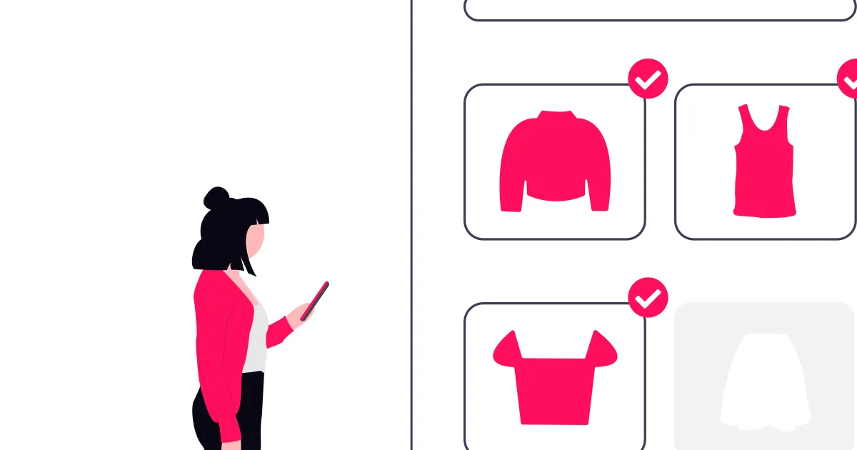
Anatomy of a Product Page That Converts
The product page is the core of your conversion funnel. It is where the purchase decision crystallizes or evaporates. According to Baymard Institute data, 69.82% of carts are abandoned in 2026. Product page optimization attacks this problem directly by maximizing the add-to-cart rate.
Visuals: the first impression
Online buyers cannot touch the product. Visuals compensate for this sensory limitation. Data shows that product pages with high-quality images on a white background convert 25% better than those with amateur photos on cluttered backgrounds.
Optimal image count: between 5 and 8 images per product. Include views from different angles, contextual usage photos, detail and texture close-ups, and at least one photo with a scale reference (hand, common object). Sites offering hover zoom or 360-degree views observe a 10% to 15% conversion rate increase on complex products.
Product video: a 30 to 60-second video showing the product in use increases conversion rates by 12% to 25% depending on the vertical. The most effective format combines a product demonstration, a highlight of key benefits, and a final CTA.
Product descriptions: inform to convince
An effective product description combines two registers: emotional (benefits, transformation, experience) and rational (specifications, dimensions, materials, compatibility). The optimal structure follows this format:
Hook (1-2 sentences): the primary product benefit, framed from the buyer's perspective. Not "Our shirt is made from Egyptian cotton" but "Wear the comfort of premium Egyptian cotton, from Monday morning to Friday evening."
Key benefits (3-5 bullet points): concrete advantages, each tied to an identified persona need. Each bullet point starts with an action verb.
Technical specifications: factual data in a scannable format (table or list). Dimensions, weight, materials, compatibility, package contents.
Size or usage guide: reduce purchase uncertainty with a precise sizing guide, a cross-brand size comparator, or a usage guide.
Price and value perception
Price display directly influences value perception. The most effective optimization techniques:
Price anchoring: display the crossed-out original price next to the current price. The perceived saving in both percentage and absolute value ("Save $30 -- that's 25%") increases conversion rates by 15% to 20% on promotional products.
Psychological pricing: prices ending in 9 ($49.99 rather than $50) remain effective, but their impact diminishes on premium products where round pricing ($50, $100) signals quality.
Cost per use: for durable products or subscriptions, display the cost per day or per use. "$0.33 per day" is psychologically more accessible than "$119 per year."
Free shipping thresholds: clearly display the free shipping threshold and the remaining amount to reach it. This technique increases average order value by 15% to 30%.
Checkout Optimization: Every Click Counts
The checkout is the bottleneck of your conversion funnel. According to Baymard Institute, the primary reasons for checkout abandonment are: unexpected additional costs (48%), mandatory account creation (26%), process too long or complex (22%), and lack of trust for entering payment information (18%).
For an in-depth analysis of checkout optimization, see our checkout optimization guide.
Single-page vs multi-step checkout
The debate between single-page and multi-step checkout is resolved by data: both formats can be effective when correctly executed. The determining factor is not the number of pages but the number of fields and the clarity of progression.
Single-page checkout: suited for simple carts (1-3 products), returning buyers, and impulse purchases. All information is visible simultaneously, reducing anxiety about the unknown.
Multi-step checkout: suited for complex carts (configurable products, customization options), first-time purchases, and high-value orders. Progress indication (step 1/3, 2/3, 3/3) structures the process and makes it less intimidating.
Reduce fields to the strict minimum
Every additional field in your checkout form increases the abandonment rate by 2% to 3%. Audit your fields and eliminate everything that is not strictly necessary for delivery and payment.
Essential fields: first name, last name, email address, shipping address, payment method. Fields to eliminate or make optional: salutation/title (unnecessary for delivery), phone (optional except for delivery notifications), company name (optional), address line 2 (optional), and any marketing field disguised as a mandatory field.
Address autocomplete: integrating the Google Places API or an equivalent service reduces address entry time by 80% and decreases delivery errors.
Payment options and trust
Payment method diversity: offer at minimum credit card, PayPal, Apple Pay, and Google Pay. Add Klarna or Afterpay for buy-now-pay-later. Each additional payment method increases conversion rates by 5% to 10% among the customer segment that prefers it.
Reassurance elements: place security badges (SSL, secure payment logos), return policy, and guarantee information directly in the checkout. These elements reduce anxiety at the most critical decision point.
Guest checkout: make checkout without account creation the default. Offer account creation after the order, not before. Mandatory account creation is the second leading cause of cart abandonment.
A/B Testing for Ecommerce
A/B testing is the scientific method of CRO. Instead of guessing what works, you test hypotheses and let data decide. See our complete A/B testing guide for methodological fundamentals.
What to test first
Elements to test are not equal in potential impact. Here is the typical impact hierarchy in ecommerce:
Maximum impact: pricing and promotional offers, checkout process (step count, fields), primary CTA (text, color, size, position), reassurance elements (reviews, badges, guarantee).
Medium impact: product page layout, product visuals (count, format, order), product descriptions (length, format, tone), category navigation and filters.
Moderate impact: header and navigation bar, homepage (hero, featured products), transactional emails, cart page (summary, upsell).
Rigorous methodology
A valid A/B test requires a statistically significant sample. For a baseline conversion rate of 2.5% and a minimum detectable effect of 10%, you need approximately 16,000 visitors per variation (32,000 for a simple A/B test). With 100,000 monthly visitors, a test takes approximately 10 days to reach 95% statistical significance.
Ground rules: test only one variable at a time (unless running multivariate tests with sufficient traffic), let the test run for at least one complete cycle (minimum 7 days to capture weekly variations), do not check results daily to avoid confirmation bias, and define duration and success criteria before launching the test.
Recommended tools
| Tool | Use case | Monthly cost |
|---|---|---|
| Third-party alternatives | Simple tests, GA integration | 0 - 150 USD |
| VWO | A/B tests, multivariate, personalization | 200 - 1,000 USD |
| AB Tasty | A/B tests, personalization, campaign management | 300 - 1,500 USD |
| Optimizely | Complex tests, enterprise, feature flags | 1,000 - 5,000 USD |
| Kameleoon | A/B tests, predictive AI, GDPR compliance | 500 - 2,000 USD |
Mobile Optimization: The Silent Majority
In 2026, 72% of ecommerce traffic comes from mobile (Contentsquare data). Yet mobile conversion rates remain 40% to 50% lower than desktop. This gap represents a massive opportunity for ecommerce operators who specifically optimize the mobile experience.
Mobile-specific considerations
Reduced screen area: every pixel counts. Remove non-essential elements, prioritize information, and use progressive disclosure (reveal secondary details on demand).
Touch navigation: tap targets must be at minimum 44x44 pixels (Apple HIG guideline). Critical buttons (add to cart, checkout) must be accessible by thumb without requiring hand repositioning.
Variable connection: optimize load times for 3G/4G connections. An additional one-second load delay on mobile reduces conversion rates by 7% (Google data).
Usage context: mobile buyers are often on the move (transit, waiting lines, breaks). The experience must allow resuming an interrupted purchase (persistent cart, automatic save).
Optimized mobile checkout
Mobile checkout requires specific adaptations:
Adaptive keyboard: display the numeric keyboard for phone and credit card fields, the email keyboard for the email field (with the @ symbol visible).
One-tap payment: Apple Pay, Google Pay, and digital wallets eliminate manual payment information entry. Sites offering these options observe a 20% to 30% increase in mobile conversion rates.
Visible progression: on mobile, progression must be even clearer than on desktop. Use a fixed progress bar at the top of the screen indicating the current step and remaining steps.
Fixed CTA button: keep the validation button (place order, next step) in a fixed position at the bottom of the screen so it is always accessible without scrolling.
Social Proof: Leveraging Buyer Psychology
Social proof is one of the most powerful psychological levers in ecommerce. The principle is simple: individuals tend to adopt majority behavior, especially under uncertainty. A buyer choosing between two products will pick the one with 347 reviews and a 4.6-star rating over the one with no reviews. For a deeper dive into social proof mechanics, see our social proof guide for conversions.
Customer reviews and ratings
Customer reviews are the pillar of ecommerce social proof. Data shows that:
Review count matters as much as the average rating. A product with a 4.2 out of 5 rating and 200 reviews converts better than a product with 4.8 out of 5 and 5 reviews. The critical threshold is 30 reviews for the rating to be perceived as reliable.
Negative reviews are useful: a 100% positive review rate is suspicious. Products with a mix of reviews (85-90% positive, 10-15% negative or neutral) convert better than products with only 5-star reviews because they are perceived as more authentic.
Customer photos and videos increase trust by 30% to 40%. Encourage reviews with photos by offering an incentive (coupon, loyalty points) to customers who share visuals of their purchase.
Review response format: systematically responding to negative reviews with professionalism increases conversion rates by 10% to 15%. The response shows the brand cares about customer satisfaction and takes problems seriously.
Real-time popularity indicators
Scarcity and popularity indicators exploit urgency bias and FOMO (Fear Of Missing Out):
"X people are viewing this product": displaying the current visitor count on a product page increases add-to-cart rates by 5% to 12%. This signal works through social validation (if others are interested, the product must be good).
"Only X left in stock": low-stock indicators increase conversion rates by 8% to 15% on affected products. Use this technique honestly: displaying "Only 2 left" on a product you have 500 units of destroys trust when the customer returns and sees the message is still displayed.
"X sold this week": recent sales counters reinforce social validation and create a trend perception.
Trust badges and certifications
Secure payment badges: payment method logos (Visa, Mastercard, PayPal) and security badges (SSL, PCI DSS) reduce anxiety at the payment stage. Optimal placement is directly below the payment form.
Guarantees: clearly display your return policy, satisfaction guarantee, and shipping terms. Positive formulations ("Satisfaction guaranteed or your money back within 30 days") convert better than neutral ones ("Return policy available").
Certifications and labels: industry quality labels, ISO certifications, and awards add a layer of institutional credibility. Place them in the footer and on the checkout page.
CTA Design and Optimization
The CTA (Call to Action) is the final element between the visitor and conversion. Its optimization has a direct and measurable impact on conversion rate. For a comprehensive guide on effective CTA design, see our effective CTA design guide.
CTA text
CTA text must be specific, action-oriented, and communicate value. A/B tests consistently show that:
"Add to cart" outperforms "Buy" by 10% to 15% on product pages (less commitment, therefore less friction). "Place order" outperforms "Submit" by 30% or more at checkout. "Try free" outperforms "Sign up" by 20% to 25% for offers with trial periods.
Color and contrast
CTA color has no absolute value ("red converts better" is a myth). What matters is contrast with the rest of the page. The CTA must be the most visible element on the page, immediately identifiable without cognitive effort. Test different colors while ensuring each variant maintains maximum contrast with the background and surrounding elements.
Position and size
The primary CTA must be visible without scrolling (above the fold) on both desktop and mobile. On mobile, a fixed CTA at the bottom of the screen (sticky CTA) increases conversion rates by 15% to 20% on long product pages. The minimum recommended size is 44x44 pixels on mobile, but wider CTAs (100% screen width on mobile) generally perform better.
Segmentation and Personalization
Personalizing by segment
Personalization increases conversion rates by 10% to 30% depending on sophistication level. The highest-impact segments in ecommerce:
New vs returning: adapt messaging and offers. A new visitor needs reassurance (reviews, guarantee, brand introduction). A returning customer needs convenience (quick reorder, history, personalized recommendations).
Traffic source: a visitor from an advertisement has specific expectations defined by the ad. Ensure coherence between the ad message and the landing page (message match).
Browsing behavior: visitors who view more than 5 pages or return multiple times are warm prospects. Trigger targeted offers (promo code, free shipping) to facilitate conversion.
Device: beyond responsive adaptation, tailor content and CTAs to the mobile vs desktop usage context.
Product recommendations
Product recommendation systems increase average order value by 10% to 25%:
"Customers who bought this also bought": cross-sell based on purchase data. Optimal placement is on the product page and in the cart page.
"Recommended for you": personalized recommendations based on browsing and purchase history. Optimal placement is the homepage and marketing emails.
"Frequently bought together": intelligent bundles combining complementary products at a package price. Optimal placement is the product page and cart page.
Measuring and Managing CRO Performance
Essential metrics
| Metric | Formula | Ecommerce benchmark |
|---|---|---|
| Overall conversion rate | Orders / Unique visitors | 2.0 - 3.5% |
| Add-to-cart rate | Adds / Product views | 8 - 12% |
| Cart abandonment rate | Abandonments / Carts created | 65 - 75% |
| Checkout completion rate | Orders / Checkout starts | 40 - 55% |
| Average order value | Revenue / Order count | Varies by vertical |
| Revenue per visitor (RPV) | Revenue / Unique visitors | Varies by vertical |
| Customer lifetime value (CLV) | AOV x Frequency x Duration | Varies by vertical |
The continuous improvement framework
1. Observe: collect quantitative data (analytics, funnel, cohorts) and qualitative data (heatmaps, session recordings, surveys, interviews).
2. Hypothesize: formulate testable hypotheses based on collected data. Format: "If we [change], then [metric] will increase by [percentage], because [reason]."
3. Prioritize: use the ICE framework (Impact x Confidence x Ease) to rank hypotheses and concentrate resources.
4. Test: deploy rigorous A/B tests to validate or invalidate each hypothesis.
5. Learn: document results, share learnings, and integrate insights into your next hypotheses.
6. Iterate: restart the cycle with new data and insights. CRO is not a one-time project -- it is a continuous process.